Although the saying goes, “Don’t judge a book by its cover,” we more often than not find ourselves doing so as we navigate the rows of our local book store. From color scheme, to use of text, to the amount of white space left untouched, the book’s cover artwork should evoke just as poignant of a story as the words that line each page inside.
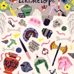
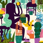
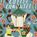
For Dutch illustrator, Marijke Buurlage, this means creating a visual language that captures the essence of a story in only a single image. Buurlage’s playful editorial illustrations are smart and compress often complex ideas down into easy-to-digest imagery, telling a story through the beautiful swooshes of color and sweeping lines she creates in her small studio space in Leeuwarden.
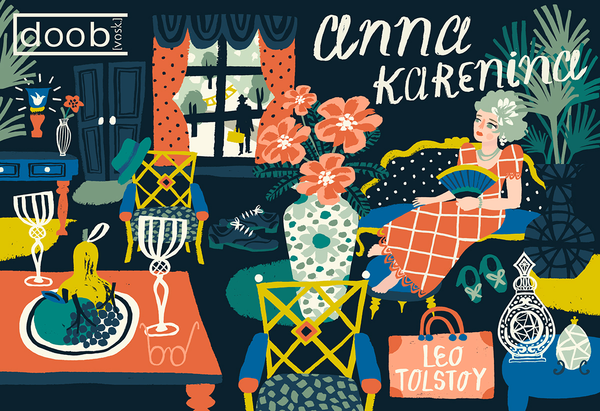
In one of her images Anna Karenina sits on a white polka dot and blue chaise lounge, staring out the window in utter contemplation. The image may focus on one particular scene in the story, but it’s illusive nature and mysterious aesthetics is enough to arouse curiosity about the book’s contents. Buurlage’s figures are usually surrounded by basic props – mostly odd plants and other random botanicals – and shapes with haphazard stripes, splatters and lines. In some images bold expanses of pattern that pose as floors or walls in the background prove a welcomed addition to all the brightness of her illustrations. It’s these details that really make Buurlage’s work stand out to be clear, communicative and exuberant.
Has your work always lent itself well to editorial illustration? Was it a conscious decision to work in this genre?
After two years of art school I decided that editorial illustration would suit me best. I’ve worked towards becoming a freelance editorial illustrator from that point on, and focused on developing my own illustration style. I love the variety that editorial illustration work offers and the tight deadlines help me to stay focused. I do still work on personal projects alongside of editorial assignments. I use those projects as a warm-up in the morning, as a distraction when I get stuck while working on editorial projects and I also use it just to enjoy myself creating things without having to worry about how it will all come together.
Does your editorial work differ from work that you would create for a show or your personal portfolio?
I really enjoy working on editorial projects, but only my personal projects and the projects without too many creative requirements have that carefree and experimental feel to it. That is probably the biggest difference between my personal projects and editorial work. It’s sometimes a real challenge to focus on creating something that fulfills all requirements and expectations of the client and at the same time trying to stay confident and creating an aesthetically powerful illustration.
Tell us a little about the process when commissioned for an editorial project. How do you familiarize yourself with the editorial beforehand to spark inspiration for illustrations? Do editors give you free reign? Is there some type of brainstorming/research/process involved?
I have been really lucky to have mostly worked with clients who give me lots of freedom while working on projects. I think that having to take too many requirements into account doesn’t enhance the quality of my work.
Most of the time I begin with reading about the subject matter and writing down ideas and making quick sketches of elements and compositions that come to mind. One of the most important parts of this process is determining my color palette. I experiment a lot with color combinations until I find the perfect color scheme for that particular project. When I start working on the final version of the illustration, I draw all elements using a brush on paper. Everything I create is drawn by hand first and then colored and arranged digitally after. I’ve been working like this for two years now and it works really well for me.
When you catch yourself doodling, what do you usually find? Is there one image or idea that you always find yourself subconsciously coming back to?
I think what mostly inspires me to doodle is nature. All the colors, patterns and shapes that you can find in nature are so amazing and beautiful! I often feel the need to sketch when I am outside and I am watching the animals and botanicals. These little doodles I make often reappear in my illustrations as decorative elements. My work often contains ornaments that are inspired by nature; I don’t think I could create anything that is really ‘me’ without these botanical decorations.
We know nothing about Leeuwarden; what is the city like? In what ways does the city influence your artwork, style, and aesthetic?
Leeuwarden is a small historical city in the north of the Netherlands. I think the city suits me really well because it’s really quiet and peaceful and it has a strong focus on arts and culture. It’s really nice to walk around in the city center. Wandering through the picturesque streets and looking at the historical buildings in Leeuwarden is really inspiring. There is also a beautiful natural area nearby the city that I visit often to walk around, relax and to get inspiration for new projects.
What was the last book, magazine, image or website you turned to for inspiration?
In my studio there is a bookcase filled with vintage picturebooks that I collect for inspiration. When I get stuck while working on a design, I grab one of those books and look at all the beautiful details and colors. That always inspires me very much! Sometimes when I give myself a day off, I spend the entire day at a second-hand store just looking through all those old picturebooks. I always end up buying one or two of them to add to my collection.
Give us a verbal tour of your workspace. Music playing? What’s on your desk? Cluttered and messy? Clean and organized? Colorful?
I work at home, so I transformed one of the bedrooms into my own studio. It’s small, but really nice and cozy. My desk is always pretty organized every morning when I start working, but at the end of the day it is filled with notes, paint, pencils, empty teacups and brushes.
Can you tell us a little about the book covers you’ve been illustrating? How did you become involved in this project? We love the Anna Karenina cover!
Thank you! The Anna Karenina cover was a piece I did for the Ukrainian brand doob.vosk that makes wooden book clutches. I chose to illustrate a cover for Anna Karenina by Leo Tolstoy, because I am fascinated by the Russian culture and I think the story itself is so interesting and poetic. I just really wanted to take the challenge to visually recreate the story and to transform it into a book cover. In the end the cover became a bright indoor scenery, that shows Anna’s indecisiveness when it comes to love. Is she going to stay with her husband, or is she going to be with her lover who is waiting for her to come along? Doob.vosk transformed this illustrated book cover into a wooden book clutch, so you can always carry your favorite book with you and even keep your personal belongings safe inside of it.
For more from Marjike Buurlage head to www.marijkebuurlage.com; or follow her instagram @marijkeillustration.