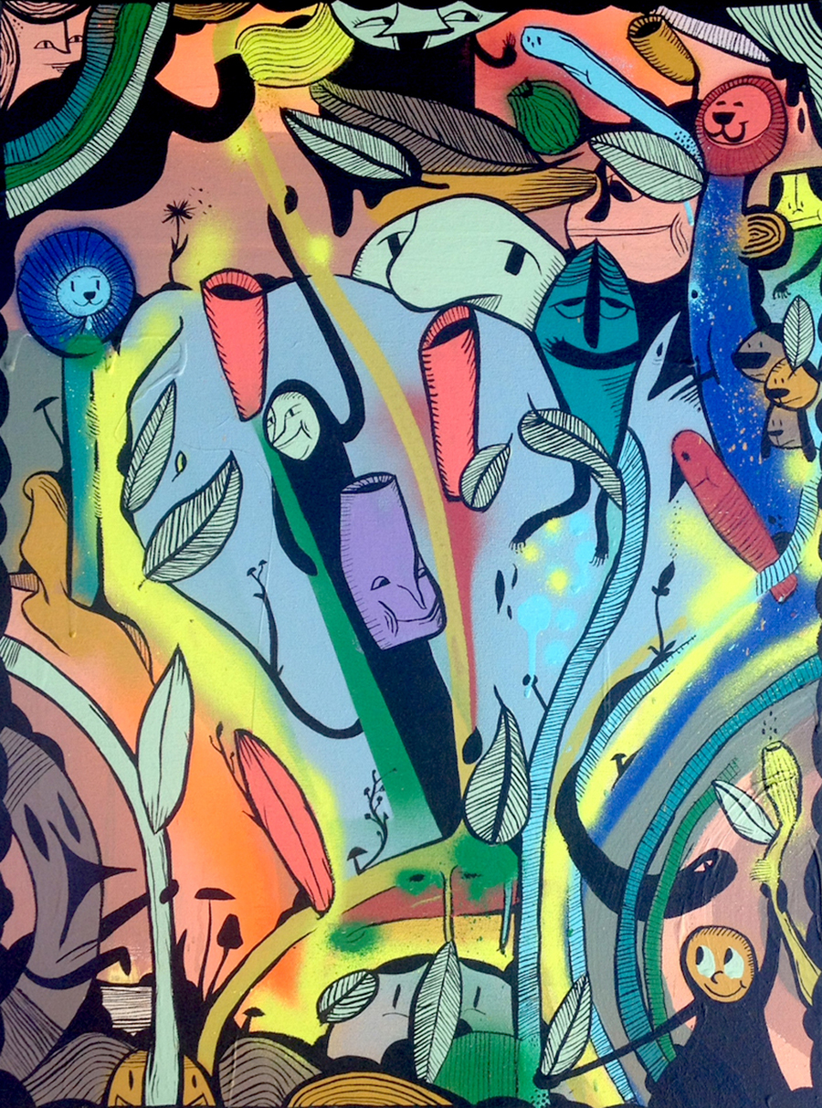
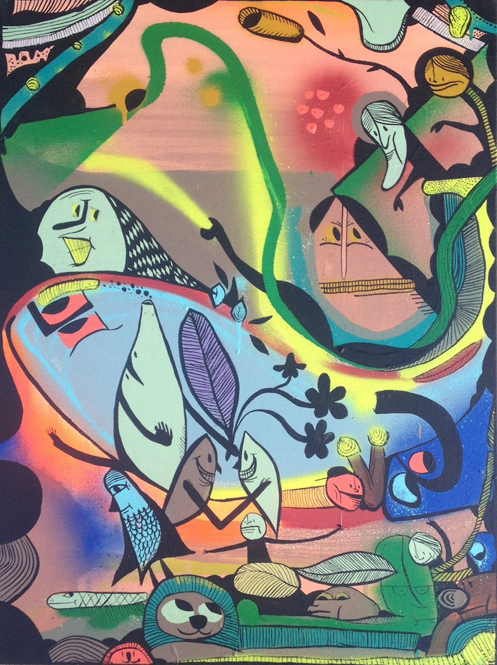
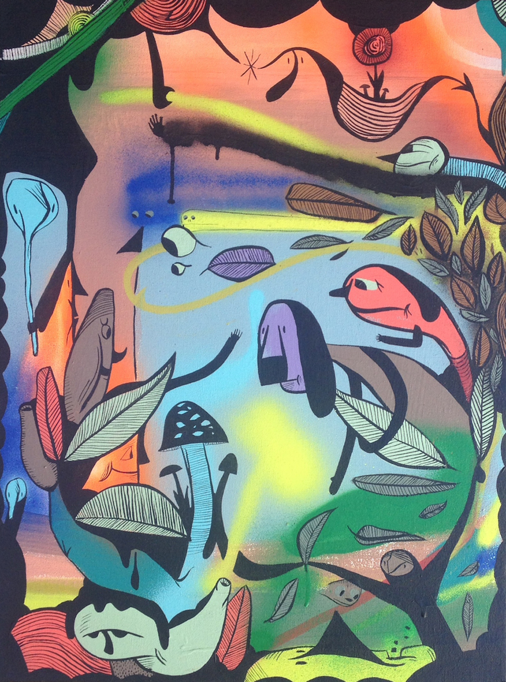
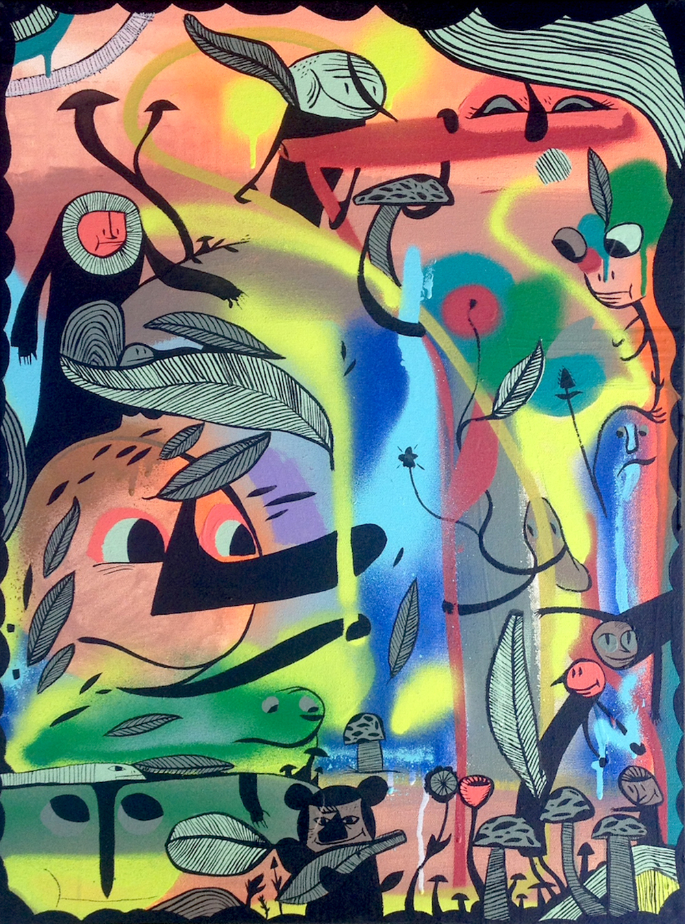
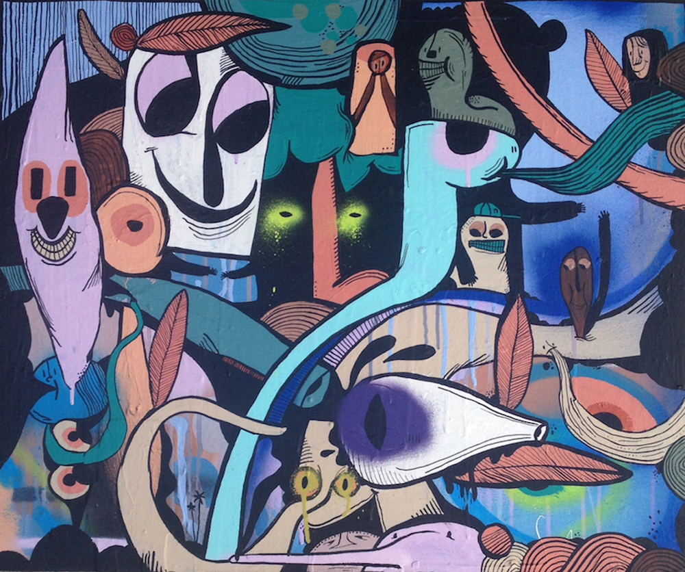
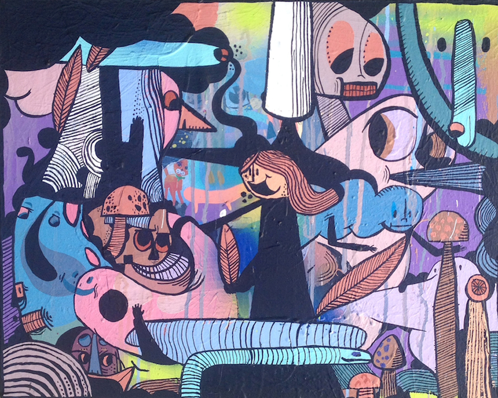
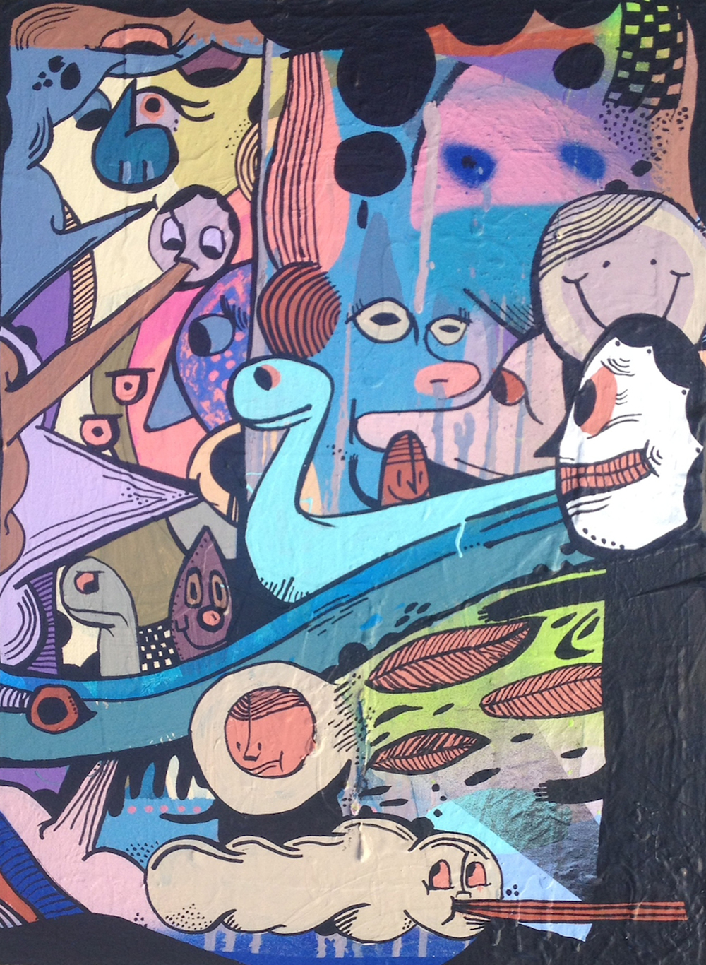
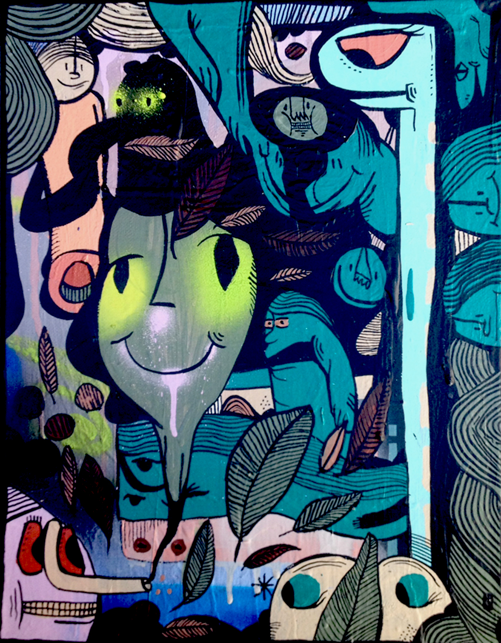
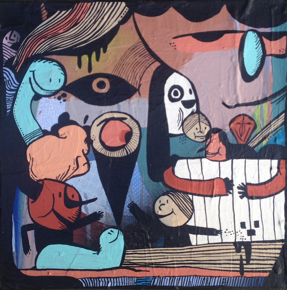
Nicholas Zaremba is the best kind of artist: no rules, no expectations, he just creates. With no fear of formats or platforms, Zaremba has created with surfaces and devices across the board, pulling in such clients as Converse, Cisco Brewers and Boston’s Institute of Contemporary Art, with his objective visions. The illustrator draws, paints and digitally designs with colors and shapes that speak to him; the animated sparks that get his mind working, all encased with black paint to crown each finished piece.
First of all: color palettes. Always bright, always fun. Where do you see these colors and how do you think they contribute to your pieces?
Most of the time for my colors I use cans of “oops paint” I find at paint stores wherever I wander. It’s a great game to hunt out different stores with dead stocks of old paint, physically finding the colors; I pick the colors I feel an immediate affection and attraction to, like they call to me.
I love color and color theory and using colors to create mood or draw onlookers in. The whole psychology of it fascinates me. The colors I work with set the tone of what’s going on and create an emotion within the piece, in my eyes.
You’ve done work on all shapes and sizes of materials, whereas many artists like to stick to one size. Is that something you enjoy doing, or do you prefer one to the other?
Up until really recently I’ve made works on surfaces, shapes, and sizes that I’ve basically just come across, a lot of found objects, nothing too, too conventional—I never really put much thought into my selection of platform. I’m a big fan of just working with whatever comes across my path. Nowadays, though, contrary to how I’ve been operating in the past, I’ve been making an effort to work in similar size series, more uniform, purposely choosing to work like this, and it’s been a new idea for me and it’s making me feel great. I’m thinking less about the shape or vehicle and more about what’s on it. It used to be the opposite for me. Because of this newer practice I’m feeling a better flow to my pieces and work manner in general.
When you catch yourself doodling, what do you usually find? Is there one image/idea that you find yourself subconsciously coming back to?
When I’m doodling, I’m usually doodling some form of my name, “Nick.” It’s elementary, I guess, but it’s always been what my pen goes to, then breaks off into patterns of scribbly-scratch, eyeballs and faces. Honestly, this hasn’t changed much since I was 7 because I have collections of drawings from way back every year since I was 7 (my mother keeps them in a box) and it always includes these elements.
Where does inspiration come from?
Inspiration for me comes via a combination of studying graffiti from all over; mainly my favorite elements such as tags, line work, and bubble letters. Also, I’m very inspired by classic cartoons and animations from the 50s onward to the 90s, old signage graphics from children’s toys, Ralph Steadman, Gahan Wilson, and the diverse works and styles of Picasso. The other big part of inspiration for me comes from nature and the way my father instilled Native American respect for the Earth, animals, spirits, and plants in me.
What’s your creative process like? Or do you have a process at all?
My creative process comes from just being a studio rat, every day being there, swilling ice coffees, reading books, listening to music, being at one with my pieces and occasionally taking time to play ping pong against my studio mates Jay Lacouture, Dana Woulfe, and Josh Falk. With my pieces specifically, I usually don’t have much of an idea of what I’m doing until all my gestural marks and color splotches are laid down very loosely, then I look at what’s going on on the canvas and bring the black in to shape what’s going on— black paint is always my last layer!
You’ve been collaborating with Boston’s Trifecta Editions for some time. Tell us a little bit about it as they prepare for their one-year anniversary.
My collaboration with Trifecta Editions was a really easy and natural one. I have known Helen [Popinchalk] since we worked together in the early 2000’s at the Institute of Contemporary Art here in Boston. We always got along and shared many many ideas on aesthetics and creative freedoms. In 2012 Helen approached me about printing work I had been making at her studio, and I was with it immediately. The vibe was right and everyone I worked with was supportive of the aesthetic I was currently into and working with. At the end of our studio processes we were all really happy with what was produced!
For more from Nick, check out his website here.

