What is ‘good’ design?
Does it adhere to the rather traditional belief that form follows function or is it something that falls within German-designer, Dieter Rams’, 10 principles of good design? Frankly, it’s neither. Good design is mostly about having good taste in general. Everyone that has good taste could be a designer. Good design looks effortless; it brings something new to the table and makes you think, ‘Why didn’t I think of that?’
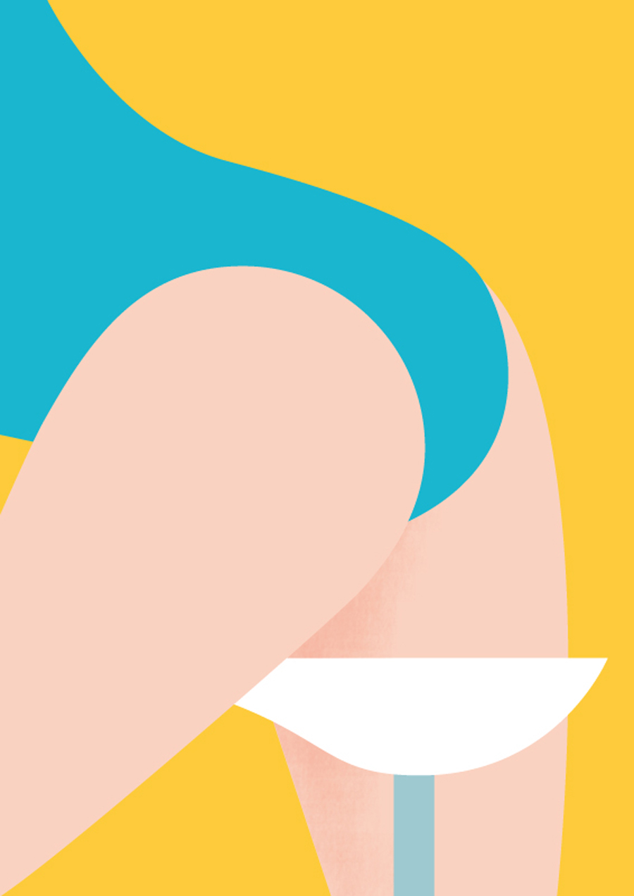
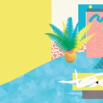
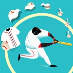
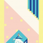
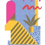
These are the exact notions that illustrator, designer, and savvy screen-printer, Josh Mckenna’s work invoke after examining each of his pieces that appreciate graphic lines and very obvious color. His design is minimal with soul and humor; horizontal and vertical structures follow each other in serial and modular orders within the rectangular limits of the canvas. McKenna is an energetic artist who likes three sided shapes and who works proficiently with a silk-screen, creating bold artwork for the likes of Wall Street Journal, Marie Claire, BBC, and ESPN.
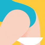
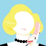
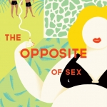
His style can be easily identified for its simplicity and clarity; perfectly in tune with an era when pop culture was dominated by the post-punk flamboyance of the 80’s new sex appeal. Asymmetric layouts, vibrant tropical-inspired colors, and post modern influences mix in the London-based artist’s head where he sifts through ideas, picking some things subconsciously, and assembling his impactful imagery onto the canvas like a jigsaw puzzle.
When you catch yourself doodling, what do you usually find? Is there one image/idea that you find yourself subconsciously coming back to?
I never consciously remember what I doodle when I do – I’ve just looked around my desk at all the loose post-it notes and there’s a variety of different squiggle shapes, confetti and some shiny sausages.
Falmouth is right on the coast, and the imagery in your work has a very tropical aesthetic. Do you think your environment and setting have an influence on your work? Does it play in to your color palette?
Absolutely. I grew up in a coast-side town not far from where I studied, so living between the two has had a lot of influence on my work. Palm trees are everywhere down there, ones that have grown naturally and huge ones in people’s front gardens. Never being more than five minutes from the ocean is pretty inspirational too ~ summertime in Cornwall is quite hard to beat. The crystal clear turquoise ocean, the bright sand and all the pastels of ice cream are all influenced in my work.
We can totally see that 80’s graphics and mid-century inspiration come through in a lot of your pieces. What do you love about this style?
It’s all about the freedom, liberation and excitement of change – especially during the 80’s. Technology was moving on so quickly, marketing and advertising and consumerism was so flashy and provocative and things got really, really sexy. Sex appeal was selling things and that for me is really fun.
What artists and mediums do you look to for inspiration?
Everyday I find someone or something new that inspires me. Just the other week I stumbled across ‘One We Made Earlier’ who make amazing accessories. I’m really enjoying the comeback of the Memphis art movement and I find that has a fun effect on my work. Besides that I have a few favourite artists that I like to follow ~ Olimpia Zagnoli, Gavin Potenza, Clay Hickson, Kate Moross, Toni Halonen and Jordy Van Den Nieuwendijk amongst many.
Now you are, or were, in your final year at Falmouth. How do you see your work shifting from academia to commercial, if at all?
Well I graduated last month and have moved to London to make it as a freelance illustrator. My work was heading in a more commercial direction towards the end of my degree as a result of commissioned work. I’m pushing my commercial work while I am up here, meeting with art directors and different agencies around London looking for the next bit of freelance work to pay for the roof over my head.
How did you originally get into screen printing? What was the last print you made? What’s the biggest screen print you’ve made?
From the beginning of my degree I was always keen to try screen printing, the way that images look when they are screen printed is really unique and there is a lot of skill behind the process, so I knew I wanted to learn. We had very small printing facilities at university and I would take advantage of these once a week at screen printing club. Over the years I managed to master these skills and become a speedy and proficient printer, something I hope to carry on when I find an affordable studio to do so. To date the biggest screen print I dared to do has been A1 in size – Memphis inspired coffee and bagel print – a wedding present for my friends. Printing that big is quite a challenge!
So tell us a little about your process. You work extensively and proficiently in Photoshop and Illustrator; do you doodle first, then go into Illustrator to refine? Or do you do it all in those programs?
It all starts with my sketches, I have a big sketchbook with hundreds of tiny thumbnails. I start by writing stupid ideas down and then perfecting them into thumbnails, playing around with composition. I then sketch these thumbnails bigger and then even bigger until I am happy with the way they look. They get scanned onto my computer and I’ll trace over them using Illustrator to create the smooth lines and curves. I’ll then take the image into Photoshop to ‘roughen’ things up – adding shading and sometimes a little texture, giving my images a little more depth.
Have your artwork and illustrations always lent themselves well to editorial work? Or did you at some point make a conscious decision to pursue editorial illustration?
Editorial work is a great place to start on the ladder of commercial illustration, there are a lot of newspapers and magazines out there that have articles that need to be illustrated. I find editorial work to be the most rewarding as it forces me to really use my brain and think conceptually about an article. Sometimes really dry articles are the most fun to draw as you pull imagery out of nowhere. I also work quickly and editorial turn arounds can be pretty tight.
Tell us about the Just Us Collective. When did you become involved? We know you have an upcoming showcase with the Collective coming up right?
Just Us is a great collective that represent some of the best emerging illustrators. To be part of the collective we had to show a couple of pieces of work and write a small blurb about why you wanted to be part of it and then it was all down to votes. After we were voted in we were then part of the collective and shared a communal website which displays our current portfolios and we have a very exciting show at the end of the month in Shoreditch, London. I was asked to create the posters based on a ‘Show & Tell’ theme.
What’s your idea of the perfect summer day in Falmouth?
My last week in Falmouth before I moved to London was the perfect way to say goodbye. Swimming in the sea, laying on the beach, eating at barbecues and getting tanned, it was pretty amazing. I miss the sea.
For more from Josh Mckenna head to jshmck.


