
“The lack of cursive handwriting skills being taught in schools limits our access to history,” said curator Meredith Kasabian of Best Dressed Signs. She was explaining the inspiration for the show, Its Virtue is Immense: A Pre-Vinylite Society Tribute to Script Lettering, at a sign-painting demo in downtown Boston’s Lot F Gallery Saturday afternoon.
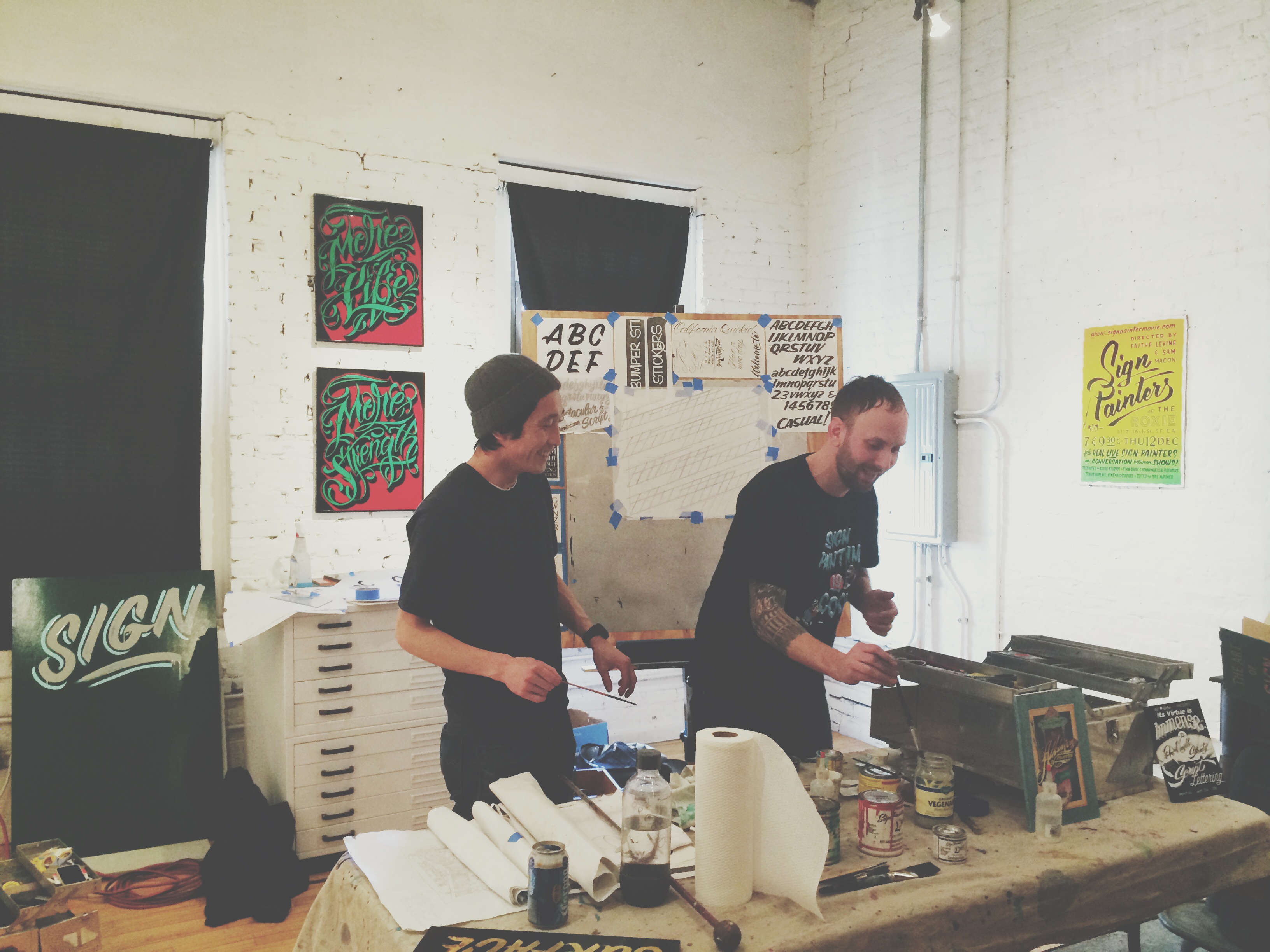
“My friend emailed a group of us saying his daughter’s school wasn’t going to teach cursive handwriting anymore.” Kasabian warned of the homogeneity we subscribe to on a daily basis when faced with computerized text. In an effort to bring awareness to both the art of sign-painting and script lettering, as the endangerment of the two are so closely linked, sign artists Josh Luke and Kenji Nakayama gave a demo on the materials and techniques of sign painting.
Veteran sign-painter Josh Luke passed around transmission fluid-soaked brushes—a trick used to keep the bristles from drying out—and handouts of the alphabet complete with directional arrows for the newbies in the crowd. Luke gave demonstrations of the casual and gothic alphabet on tracing paper, much how apprentice sign-painters train for months when first starting out. He shared personal tips of the different ways to turn the brush to create squared-letters and shadows.
Japanese expat Kenji Nakayama followed with a demonstration of script lettering. He explained the importance of even slants and fluidity between letters as he—almost effortlessly—painted the cursive alphabet. Nakayama drew various versions of the same letter, showing how personal flare can shine through in the curves and swirls added to script. He explained his distinctive technique—coined “fat-bottomed” script—which can be seen in his contributions to the show, as an effort to give weight to the letters and words he was painting.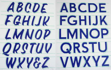
The different styles of all the artists featured in Its Virtue is Immense can be seen in the thickness, shading, and colors of the script displayed—as unique as anyone’s own handwriting.