Lawrence Azzerad’s entrance into designing artwork for music was an accidental occurrence. Having initially went to art school for illustration, Azzerad quickly realized he liked working in design – messing with typography and interacting with photography – in order to create pieces that had a broader range of connection with people. For Azzerad, graphic design was a greater way for him to make an impact culturally.
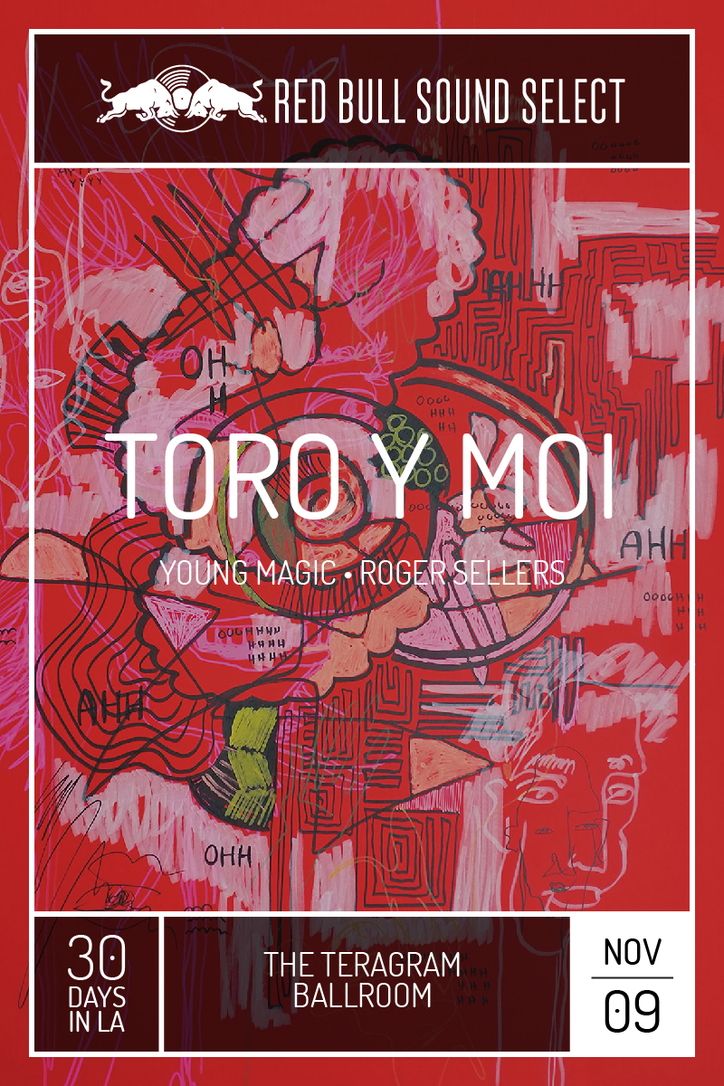
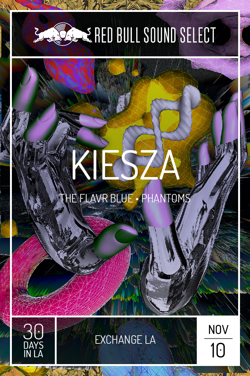
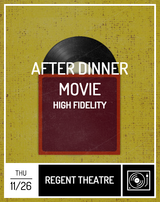
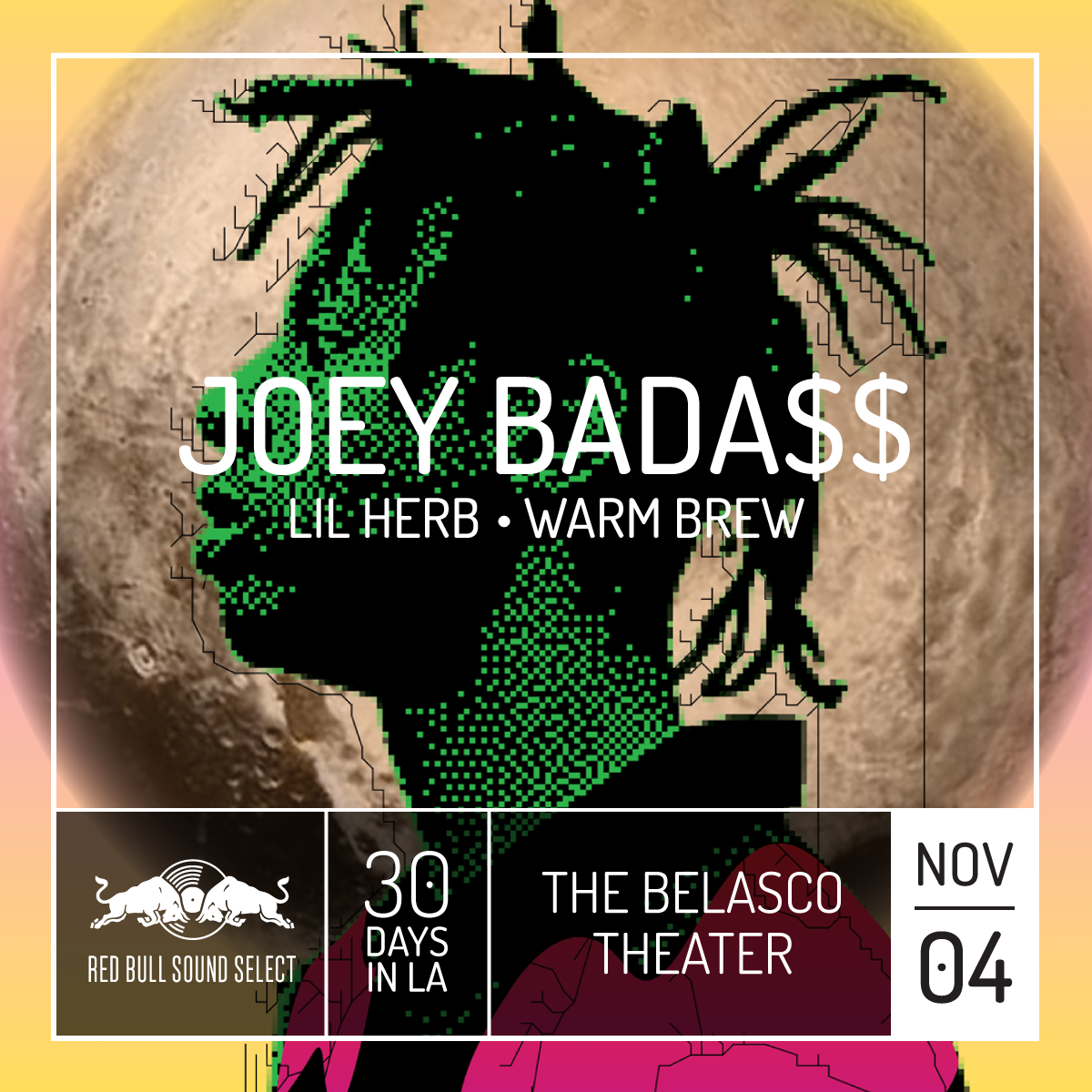
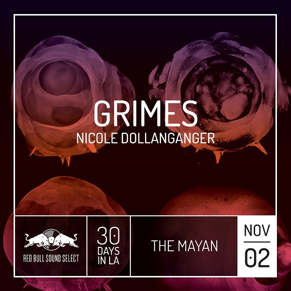
Since that fateful decision to continue his visual practice with graphic design, Azzerad has not only done album artwork for a number of music artists including The Red Hot Chili Peppers and Miles Davis, but he’s also fostered a 17-year working relationship with the band, Wilco, and now for the second year, has acted as Creative Director for Red Bull Sound Select’s 30 Days in LA. Red Bull’s month-long music festival, which starts tonight, will feature some incredible headliners including Grimes, Flume, Toro y Moi and TV On The Radio, however another big talking point at all of the shows is the special art posters made for every night of music and the entire series.
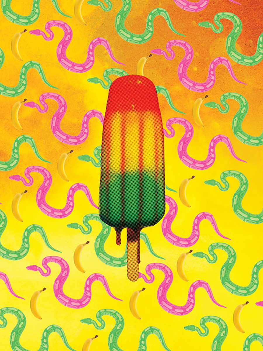
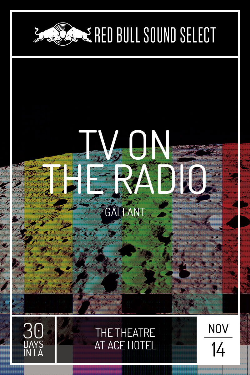
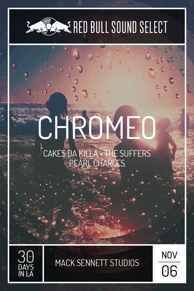
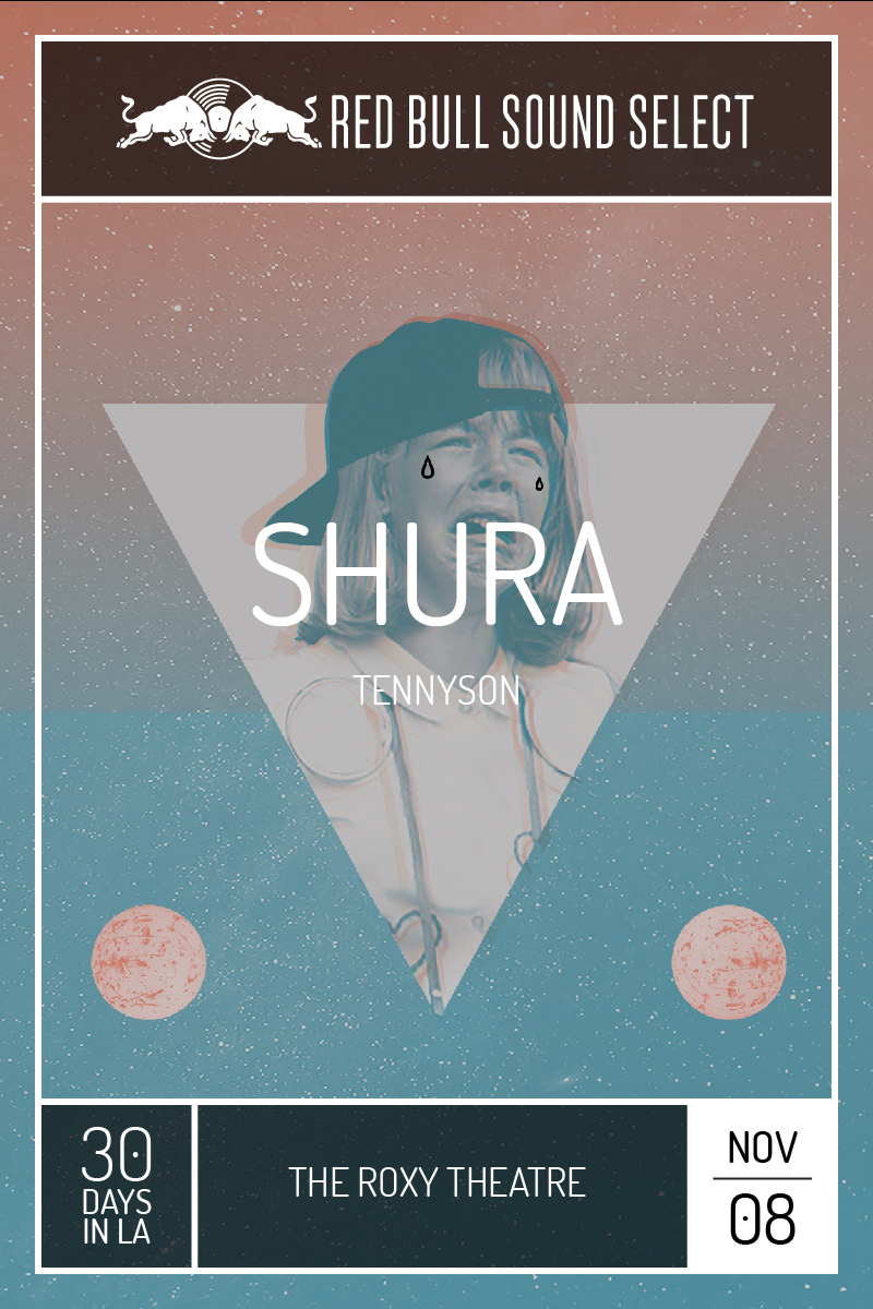
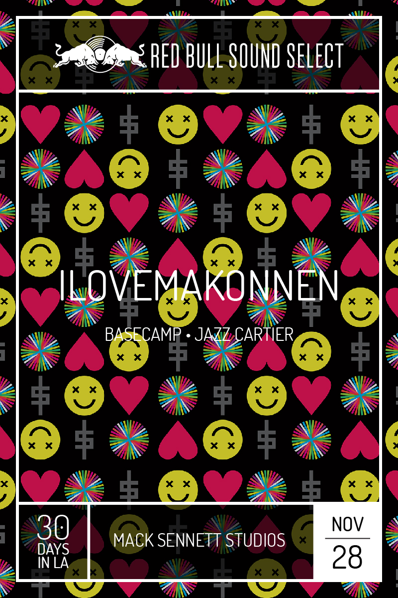
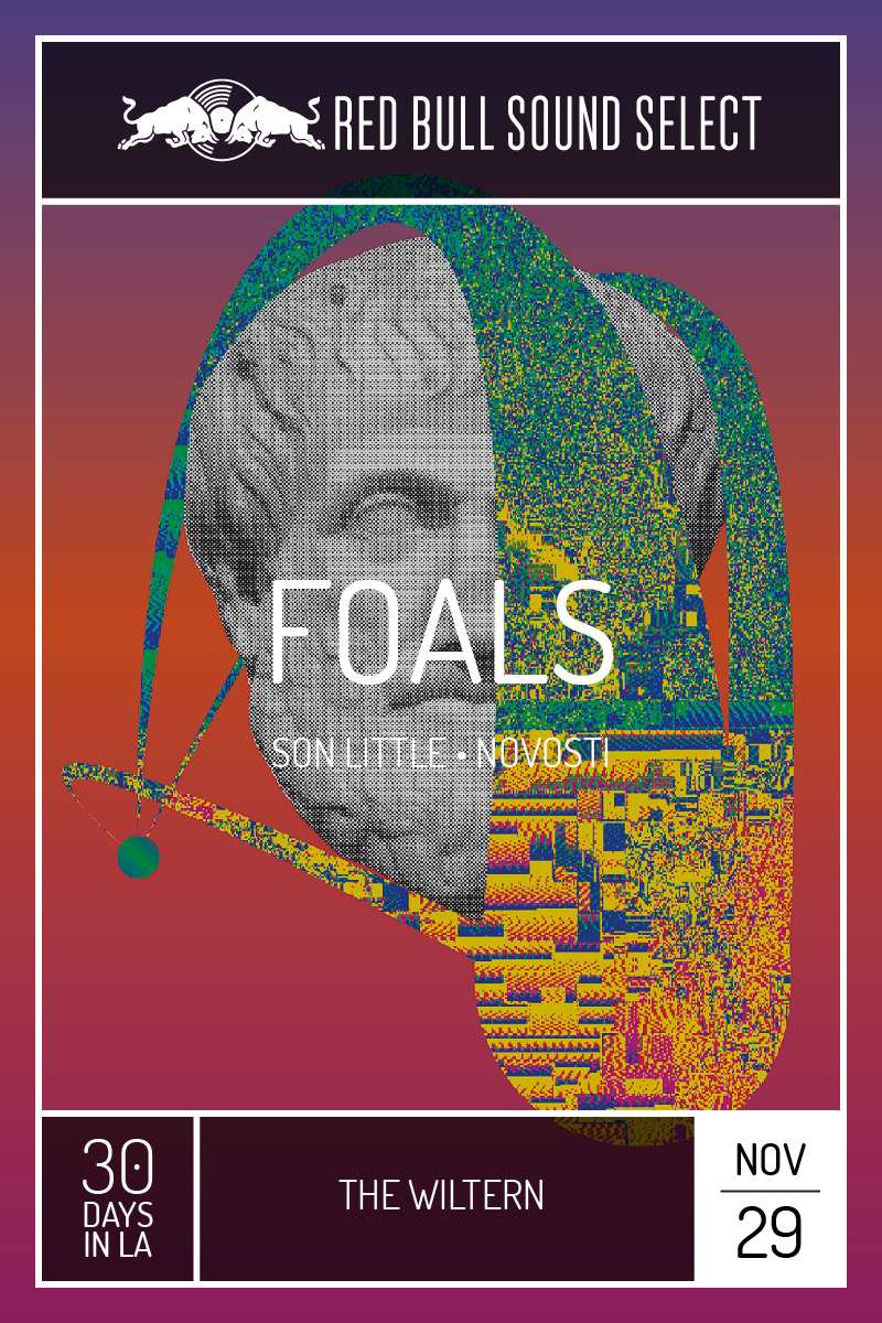
This year, Azzerad has curated a select group of artists working in a range of mediums – collage, paint, photography, graphic design – to fashion an eclectic catalog of show posters that visually translate each music act’s underlying style and sound. Azzerad’s continued devotion to creating and curating visual work that has an expansive cultural reach proves an integral aspect of his working process, and has helped guide the creation of these posters to reflect the spirit of the music, so the viewer can really recognize that the visuals echo he music.
Amadeus had a chance to chat with Lawrence Azzerad about the month-long festival, having the rare opportunity to speak to the city of Los Angeles at large through these poster designs, and why there is something really crucial about having a proper visual representation for the music.
What intrigued you most about Red Bull Sound Select’s 30 Days in LA music event?
Well, it is such a special event. It’s real rare that an event covers so much of the city and so much culturally; it’s such a diverse spectrum geographically and musically. You have everything from hip hop, to electronic, to rock and usually when you’re working with a typical music project you’re speaking to a specific audience, but this gives you the rare opportunity to speak to our city at large and a real wide range of people interested in the community. A large part of my work and a large part of my purpose is making stuff that makes an impact on people culturally. That is our main mission in the LAD studio. This provides us a great chance to reach people as largely as possible. It’s not just a rock silo and electronic silo.
A lot of your design work has been interconnected with music, from designing album covers, to creating packaging and other artwork for musicians, do you find that there is something really crucial about having a proper visual representation for the music? Can an album cover, or artwork for a musician make or break an album, or show?
Yeah, absolutely, since I’ve been creating artwork for music for so long, I’ve realized how it’s a real important part of the music process. It is the visual voice of what the music is all about. It’s something tangible, physically, visually and mentally. It adds an entire other dimension to the experience of the art so it’s not just about that listening experience. It’s about seeing it and it expands the presence culturally. When you see a great album cover in rock music history, it’s not just about the songs, it’s about the fashion, the posters, and the graphics that accompany it. It’s really nice to be apart of expanding that kind of cultural impact. That’s what making art and making music is all about, putting an impact in people’s lives.
The main vision is really two fold. We wanted to faithfully reflect through visuals what sets the tone of each individual artist. We wanted the poster to reflect the spirit of what the music is, so the viewer would really recognize that it echoes what the music is about. We also wanted to look at tying together Los Angeles. LA is so broad geographically, and since the event is 30 days, it covers so many different venues. We wanted to touch on the idea that this festival draws all of us together, whether you’re in Highland Park or whether you’re in Venice Beach. Music draws us together geographically, culturally, across distances, across all the freeways. That’s kind of why the main poster artwork is the overlaid images of the freeways. It’s about all these roads that connect us all together and maybe we are more connected than we are separate.
Which posters did you and your studio design?
How did you select the artists that designed the posters this year?
It was really important to bring in a diverse range of visual voices, and a diverse range of artistic voices. I’m a big believer in staying connected to your creative community. I tried to reach out to a spectrum of artists that would reflect a large range of styles just like the music. We had a really great Chicano artist who did one of the posters for school night. He’s really different from some of the upcoming artists involved that do a lot of hyper-collage work; more indie, heavy rock-n-roll, kind of collage work. We also looked to incorporate more straightforward photography. Again, it was really about trying to develop a visual spectrum. It wasn’t one visual voice; some of them are more painterly, organic, or graphic. We really wanted it to be a large spectrum, just like the music is.
Did you find yourself having to give graphic and design guidelines to the artists involved? Or having known each of these artists’ work, gave free reign?
A little bit of both, at the beginning I shared my little bit about Los Angeles and all of us being tied together and what ties us together is more than what separates us. That was the instigating concept, but people ended up creating based on their interpretation and reflection of the music. It was important to me to kind of let that shine and be honest. We interestingly, this is kind of a rarity, made a conscious decision that we didn’t want to show any of the musicians in the artwork. All of the art just reflects the music artistically. We wanted to have it be a little bit more artistic.
It is certainly privilege to have the chance to work with so many great talented artists, and to work with an organization that has the means and the cultural reach to have it connect with so many people in our community. I think Red Bull has done a really great job to drawing peoples attention to a 30-day festival and doing it in a way that makes people really excited for the music. To create art for a whole festival that is comprehensive and artistic, and that this many people in our city are going to take notice of, is an absolute privilege. The people at Red Bull are really great. I work with a lot of different labels; the fact that they want to make something culturally relevant and valuable is great.
For tickets and to see the full catalog of posters for 30 Days in LA, head to https://www.redbullsoundselect.com/30days.
BESbswyBESbswyBESbswyBESbswyBESbswyBESbswyBESbswyBESbswyBESbswyBESbswyBESbswyBESbswyBESbswyBESbswyBESbswyBESbswyBESbswyBESbswyBESbswyBESbswyBESbswyBESbswyBESbswyBESbswyBESbswyBESbswyBESbswyBESbswy

