BESbswyBESbswyBESbswyBESbswyBESbswyBESbswyBESbswyBESbswyBESbswyBESbswyBESbswyBESbswyBESbswyBESbswyBESbswyBESbswyBESbswyBESbswyBESbswyBESbswyBESbswyBESbswyBESbswyBESbswyBESbswyBESbswyBESbswyBESbswy
Graphic design. The visual proxy of contemporary marketing. Contextually, it represents a culture of digitally-tweaked appeal, teaming visual verbatim with consciously constructed colors and shapes and images; culturally, it represents the phenomena of aesthetic communal engagement in the public domain, spanning the breadth of its digital capabilities to translate raw purpose with allure.
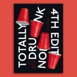
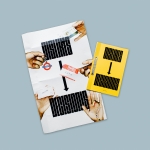
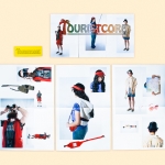
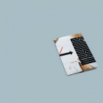
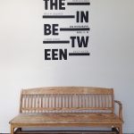
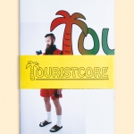
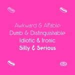
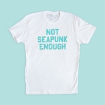
It’s that impact on public engagement that guides the productions of Chris Chew, a New England-based graphic designer of the dope, minimalist variety. Chew is a culture monger, surveying design in a social context and creating in reaction to the promptings of contemporary musings, all the while championing white space with thoughtful, minimalist intent. It’s the rare work of viable realism, straddling relevant and arbitrary while recounting susceptible realties, and damn near nailing graphic design to a T.
Chew designs as an offshoot of intrigue, and vice versa. Be it typography or a hand-bound zine, printmaking or digital tampering, his designs impart curious yet implicit wits of aesthetics—from self-qualifying breaks of white space to the well-queued curls of a serif—and an architectural eye that morphs mere printed matter into exceptional visual tokens requiring little introduction. We simply can’t get enough of the culpable genius—and so, without further ado: Chris Chew.
Who is Chris Chew? Kindly introduce yourself.
I am a graphic designer based in New England. My interests lie in the cultural sector of the design world and in art and design discourse. I’m really enamored with music—I know that’s like everyone’s thing, but if I had another lifetime of hours to devote to something, I’d study audio engineering. I’m a SpongeBob fanatic: I think it pretty much shaped my entire sense of humor. And I’m obsessed with my dog because he’s hilarious.
What about graphic design excites you? How do you see graphic design guiding contemporary culture and what are your thoughts on our current visual “vibes”?
I think the fact that graphic design does guide and contribute to contemporary culture is what excites me. It’s part of the art world, the music world, the commercial world, the social justice world, all at the same time.
It’s such a broad thing now that it can be buzzwordy—“design thinking” or whatever. To clarify, I’m not opposed to applying design thinking, but I am opposed to the term being thrown around. Because of that, I like to specify that I’m focused on working within the cultural side—arts, music, graphic design itself—because that’s what excites me the most and where I think my own skills and interests are best suited. My goal is to contribute what I can do directly to those areas, as opposed to like marketing and advertising, with the hopes that those contributions and the knowledge I gain may have value in other areas, whether that’s commercial or social-political or whatever else.
Regarding current visual vibes: for a while, especially in school, I was really fixated on this experimental “ugly,” Berlin-style, kitsch aesthetic that is really prominent now, but I’ve shifted into a love for design that’s more minimal and timeless in a way—work by Experimental Jetset, Pentagram of course, this studio I just found out about: Neubau. To sort of side track, the headline for the article about Neubau was: “Confident, bold work from Berlin studio Neubau” and I was just like, “Confident! yes, that’s exactly it.” Like, you’ve got to be confident to print a poster design that’s a two-letter word, black on white paper and present it as graphic design, but it’s so beautiful the way it let’s the letterforms hold the spotlight, and it doesn’t need trendy flair stuff to be visually arresting. That’s what I see and go “I wish I had that confidence.”
But to go back to the current visual vibes out there: I think we’re seeing so much experimentation because the computer is such a powerful tool, which is fantastic. Making crazy patterns and gradients and 3D shapes is easier than it ever has been. And I do like to see and do that to an extent, too, but it happens with any emerging technology—people push the boundaries to see what visuals they can create with it, but engaging and confident ideas behind the visuals are always key.
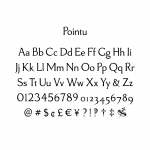
Creating a typeface is a laborious project. Can you walk us through your process and how you create and define your typefaces.
As a disclaimer, I’m not a professional full-time type designer. Those folks are on another level. Like, I spend time on it spread over the course of months, stop for weeks at time, and come back to it with fresh eyes. I’ll get some more outside opinions and sit with those for more time. And in the end, I’ve put all my blood, sweat, & tears into making like a 210 character set that’s my baby—definitely enough glyphs for a lot of applications—but a really extensive typefaces from foundries can have around 3,000 glyphs, on the high side, per font, and then like 18 families (weights, italics, widths, etc.) Of course, they’ve got teams of people and advanced tools, but my point is, trying it myself taught me how much work goes into making a good typeface, and I have a lot of respect for those who devote their working life solely to that.
It’s really wonderful though, that the technology is available now for anyone to be able to at least start drawing type, because doing so taught me so much more about how to use type. It brings to light all of these little details about letterforms that I never would have realized. Even though words are everywhere, the actual construction of letterforms is something we don’t usually think about, because we aren’t supposed to. Both type designers and graphic designers are often designing to make the type go unnoticed so as to not distract from the content itself.
For me, the two-and-a-half typefaces I’ve worked extensively on have been labors of love, not commissioned, so I got to be my own client and decide my own goals. That’s challenging in its own way because you need to really create the challenges—there’s a danger is leaving it too open ended and making no consistent decisions. One crucial part of the process that I learned from my type design teacher, who is a fantastic, full-time type designer as well as one of the kindest people I’ve ever met, is to have as specific an application in mind as possible. Knowing what you want to make it for—magazine headlines, book text, carved in headstones—and then studying other examples of typefaces made for those same applications helps you make decisions. In reality, it will take on a life of its own once it’s in the hands of designers or the public, but there’s no point in trying to make the next Helvetica because then you’ll just have too broad of a vision to wrangle.
“Print is Dead.” Do you agree, disagree, does it make you cry? How do you think your work lends itself to the argument or counterargument?
It doesn’t make me cry because I totally disagree! Check out Print Isn’t Dead magazine, they know what’s up. I just read an article about how print sales were up this year and e-books are down contrary to what was predicted a few years back. Same with records and tapes, they made unexpected comebacks. Stuff like that definitely becomes trendy too, and the wave will move back down eventually, but within that there are people it really resonates with who remain faithful to the medium. Unlike before, books aren’t really necessary to store information, but since we live in a material society with the means to produce and buy stuff, physical things and collections have value to us. Like, sometimes I don’t know why I collect books and records and magazines, etc, because the same content can probably all be kept on a hard drive or cloud storage, and then I wouldn’t run out of shelf space or break my back moving apartments, but there’s an emotional connection to the tangible that, at least as of now, people aren’t rushing to give up. I mean, maybe that will change if virtual reality get’s really crazy.
I definitely do think that since it’s more cost effective and obviously uses less physical resources, digital media will be the most prominent outlet for information, which is a good thing. Because of the internet, the same quality of information is more accessible to more people. A lot more garbage also gets published online, but that just comes with it. But, like I said, I think there are always the people who will carry on producing books out of passion, even if it becomes more and more of an artsy niche thing. For some people, like myself, the type of paper, and the ink on the paper, and the method by which it was put there, and who printed it, and who bound it and all that are just as fascinating as the actual words and images are.
What is your creative process like? Is it strictly regimented and to the point or is there a lot of free-flowing artistic mayhem flying around?
I think it’s in between. There needs to be a balance of having a clear goal and being open to change. I’ve learned that I can only plan so much, but there will inevitably be unexpected problems and solutions that come up only through doing. There have been times where I had the idea in my head perfectly, so I’m like, “Oh, I can put this off because I know what I’m going to do and it will only take a few hours to actually execute it,” but then I go to execute it and it just isn’t right because I didn’t lay out the building blocks first. I do work mostly on the computer—it’s ironic that I prefer consuming physical output but prefer working digitally—but I’ve learned that it’s like any other workspace, where you have to start laying out the raw materials on screen and really push them around to find the solution. Just because you’re working digitally doesn’t mean it goes straight from thought to finished product. So there is mayhem meaning like fifty artboards and things scattered off in the margins and duplicates that I don’t remember making, but it just happens to be mostly contained in the screen and not sprawled all over my desk.
For inspiration, I look through certain blogs, books, and magazines. It’s Nice That and Grafik are great. Following certain Tumblr blogs is good. I feel like as far as user-curated online platforms, that’s the best one. Like r/graphic_design on Reddit and the #graphicdesign tag on Instagram are way too cluttered with irrelevant stuff.
I always go back to certain studios that I think are really smart and seem like they can handle anything because they aren’t fixated on style. I’m more looking to understand how they choose to represent and organize information, how the concept supports the content, and how that can inform whatever I’m working on. They may end up having a studio style, but that’s not their main concern.
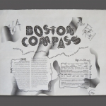
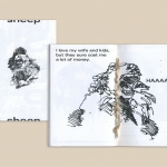
Can you speak of the zine community?
It’s exciting that the technology is widely available for desktop publishing. It levels the playing field a bit for everyone’s ideas, similar to how online publishing and the personal blogs have, but the audience is a little more refined to those who enjoy the physical aspect. Everyone involved in it is so supportive of everyone else’s endeavors too, because they share that passion and know how great it feels to have one’s own ideas reach a new audience.
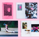
I think the meaning of “zine” itself has broadened over the past few years, because before personal computers, it was this kind of punk, cut and paste, thing, often with a strong social message, and now it can still be that, but also includes art books, photo books, magazines, comics, poetry, etc. DIY doesn’t have to mean lesser production quality. Maybe some people even separate the definitions of zine and desktop publishing more. In any case, it’s a wonderful platform for generating original ideas, content, and design in a cost effective way—well, anyone who makes zines will tell you there’s no money to be made, but cost effective in the sense that, for a small scale project, you can make and bind twenty nice books on your own instead of having to go to a printer with a 250 piece minimum.
What is your favorite:
typeface
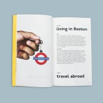
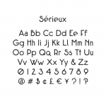
P22 Underground, which is what Edward Johnston designed for the London Underground. It’s very geometric, but has these perfect little quirks about it—is “perfect quirks” an oxymoron?—that give it a lot of character. It’s versatile while being sort of silly at the same time. I guess that’s sort of how I aim to portray myself and my work. That’s my go-to right now, like on my site and stuff. For a while, I was using my own typeface, Sérieux, which was partly inspired by Johnston’s, but it was a little too eccentric and less refined than his, of course.
InDesign command
Cmd+Opt+Shift+V: paste in place
Although, I get really annoyed that you can’t paste on to all InDesign pages at once, yet in Illustrator that same command pastes on all artboards. So in Illustrator, I end up accidentally pasting something everywhere and not noticing till later. Come on, Adobe, can’t you just get your shit together and be consistent?
website
It’s not a great “design” answer, but I get obsessed with cataloguing records and looking up & submitting release info on Discogs. That or digging for new music on SlyVinyl, NPR music, or Gorilla vs. Bear, I can really get sucked into for hours on end. In terms of rad, artistic, & entertaining: cachemonet.com
follow up with Chris on Instagram or his website.