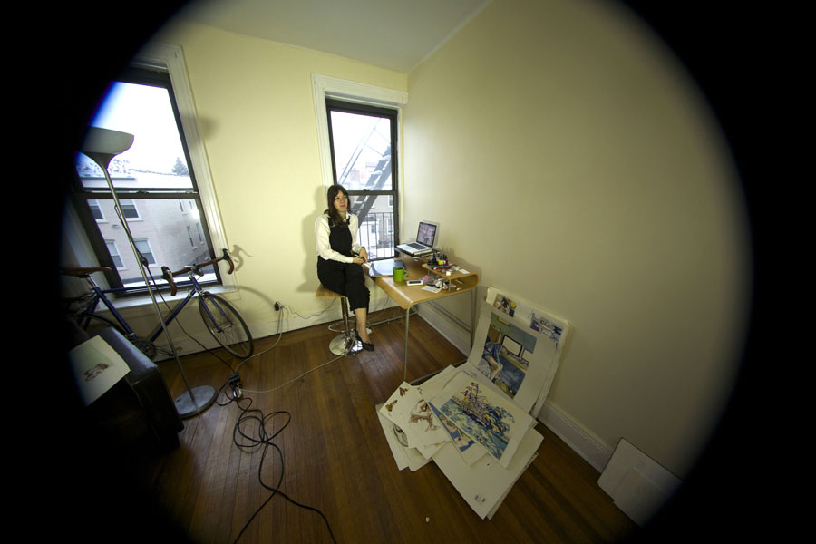
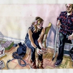
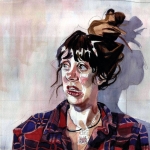
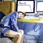
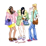
Rachel Merrill works mostly the old-fashioned way, wrestling valiantly with watercolor and pencil. She works across illustration, comics and fashion and her signature style is heavy on effervescent tones and devoid of extraneous detail, making for works that straddle a magical line between rigorous and wistful. In fact, there was a lot that drew us to her pictures; from the way she worked with pencil and watercolors to create fantastic marks and textures in her illustrations, to the real sense of purity in what she did, as well as of course her brilliant sense of fun and relevant subject matter ranging satirical fashion illustrations to storied comics.
Even her most recent experiments with portraiture are breathtaking, allowing her stylized watercolors to best communicate her personal interpretations of colors and images that float around in her head and her immediate environments. Each of her pieces has a softness and the natural contrasts in every single one of her watercolored marks lend vitality and lightness to the illustration. This leaves space for the imagination of the observer, while also maintaining necessary focus on the visual elements so that the eye isn’t left to wander the image without direction.
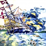
Whatever the project at hand Merrill’s goal is always the same: to transmit the essence of something, whether it’s the fluidity of the ocean in a single storyboard panel or the nuance of a face.
Give us the Rachel Merrill spiel. Who are you? What do you do? If you were a cartoon, what would your cartoon outfit be?
I am an illustrator, painter, and professional rabble-rouser. I work on comics, satirical fashion illustrations, and portraiture. My cartoon doppelgänger is Daria, who I’ve been compared to since I was 14. She gave me the tools to prepare for high school/life. I actually do have her entire outfit, though I don’t wear all the pieces at once.
Let’s talk materials; what do you primarily work with for your illustrations? What do you like most about working with these materials? What would you like to experiment with?
It depends on the project. I always start with a strong pencil drawing, and then I either develop it digitally or with watercolor. I enjoy digital for work that needs to be produced regularly, like my fashion illustrations. It forces me to tighten the drawing as best as possible (no going back!) while still getting to play with color and value.
I’m using more and more watercolor for experimental portraits and occasionally comics. I’m using it for work that I don’t need to have ready the next day, although it is a fast medium. I enjoy how rich and strong it can be. I think people view watercolor as this delicate medium, but it really has its own richness. Handled well, it’s more effective than most media.
I moved into my own space not too long ago, and am ready to get back into oils. In college that’s all I worked in, so my teachers would be pretty amused at how much I’ve taken to watercolor, considering how different the two seem.
Where does this reoccurring intersection of fashion and art come from? What’s your interest in fashion, and how did you it come to be such a prominent theme in your work?
Ever since I was little I’ve always been fascinated by characters and costumes. How clothing can be a shield and a reflection of your place in the world is incredibly fascinating, perhaps because I relate to it so personally. Eventually I’ve come to see the humor in it, the absurdity of focusing on the appropriate mainstream “look” and even counter-mainstream “looks.” It’s something I can both celebrate and mock in equal amounts.
After looking at your website we’re interested in the difference between a storyboard and comic. How do the two differ and how does your process vary when creating each? Where do you look for inspiration for your the narratives illustrated in each?
Storyboards are much more about simple communication, and showcasing information. While you can have a mood in a storyboard, it’s not meant to be read the same way as a comic like “The Sandman”. I really enjoy storyboarding books and movies I love. Figuring out what makes them work is a great learning process. Overall, I would say storyboards are practice for work like comics. I find they make me better at communication and story-telling, while not getting me too tied down in the process of making art.
When and how did “Rosencrantz and Gildenstern” come to fruition?
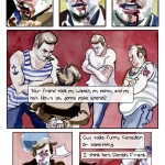
The story was written by good friends of mine, Mauricio Le Sage and Rudy Rihner. Mauricio and I have been friends going back to high school, so when they had the script ready, he approached me about illustrating it. The overall theme is about Rosencrantz and Guildenstern searching for Hamlet through time. In this particular comic, they find themselves in Pearl Harbor on the eve of the attack. We are at several comic shops Desert Island and Bergen Street Comics in Brooklyn along with Crescent City Comics in New Orleans.
What’s it like creating in Brooklyn? Is it really as over-saturated as it seems, or do you find the amount of creativity present inspiring?
I recently moved out of Brooklyn to Astoria! It really is over-saturated which has its benefits and disadvantages. Benefits include the amazing community of people, especially in comics. Growing up in a very conservative southern state, I pinch myself constantly for getting to have such a wealth of culture and creative people at my doorstep.
That said, you really have to advocate for yourself, because the market it so saturated. No one is going to hold your hand, or give you an opportunity they themselves could use. You have to learn to take that in stride and with patience.
Also the rent is a joke in Brooklyn, enough said.
Where can readers find you in your comics and illustrations? Do you materialize in your characters? Dialogue? Imagery?
You can most easily see my personality in the fashion illustrations. Those are based directly on my own personal experiences and observations. My comics are much more of a collaboration. I find inspiration in bouncing ideas around and building a point of view based on someone’s concept. For portrait and personal work, those are usually a combination of solving formal visual problems while working through the emotional content of the image.
You seem to do a lot of portraits and place people at the center of most of your illustrations. What are the things about everyday and the human form that stands out to you the most, and intrigues you enough to make them your main subject matter?
People are just innately fascinating with and without the context of an environment. Their physicality, the gestures, and baggage of lifestyle make for such interesting dichotomies. I focus on exploring and exposing that in my work.
For more from Rachel Merrill check out her website: www.rachelmerrill.net
- “Sleeping”
- “Coach Girls”
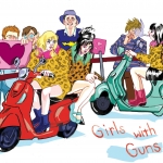
- “Girls With Guns”
- From comic series, “Rosencrantz and Guildenstern”

