Meet Tim Lahan: Illustrator, New Yorker, nonchalant humorist. Since loosening the sometimes rigid artistic reigns of a background in graphic design, Lahan has ditched the straight lines and perfect points to highlight life’s other, less-seen beauties; the daily grind at its most grind-less. Using bright, whimsical colors, he lightens not-so-whimsical images – trash bags, empty beer cans, idle faces and tired cigarettes – that allow his surrounding world to melt and become something he can manipulate.
Style is one of those things that can be dangerous; It can go in and out of fashion or date quickly. What’s most important is creating imagery that has quirk over and above aesthetic. Lahan’s images have exactly that. Sometimes it’s humor; sometimes wit; maybe they have layered meaning, or a simple story hidden in the detail. Whatever the motif may be at the time when he sits down to drag his dull No. 2 pencil across the paper, Lahan continues to execute his concepts perfectly through his super simple imagery that make his illustrations more than just pretty pictures.
When you catch yourself doodling, what do you usually find? Is there one image/idea that you find yourself subconsciously coming back to?
Hands, eyes, noses, big feet, dick jokes.
What were you doodling as a kid? Where did you grow up and what inspired you at the time?
Mostly Teenage Mutant Ninja Turtles. I grew up in central Pennsylvania around a lot of farms, gas stations and strip malls. I wouldn’t say I was inspired artistically back then, but I’m sure my environment crept into whatever I was making and still does.
Let’s play a game, we name the reoccurring themes, you name the inspiration:
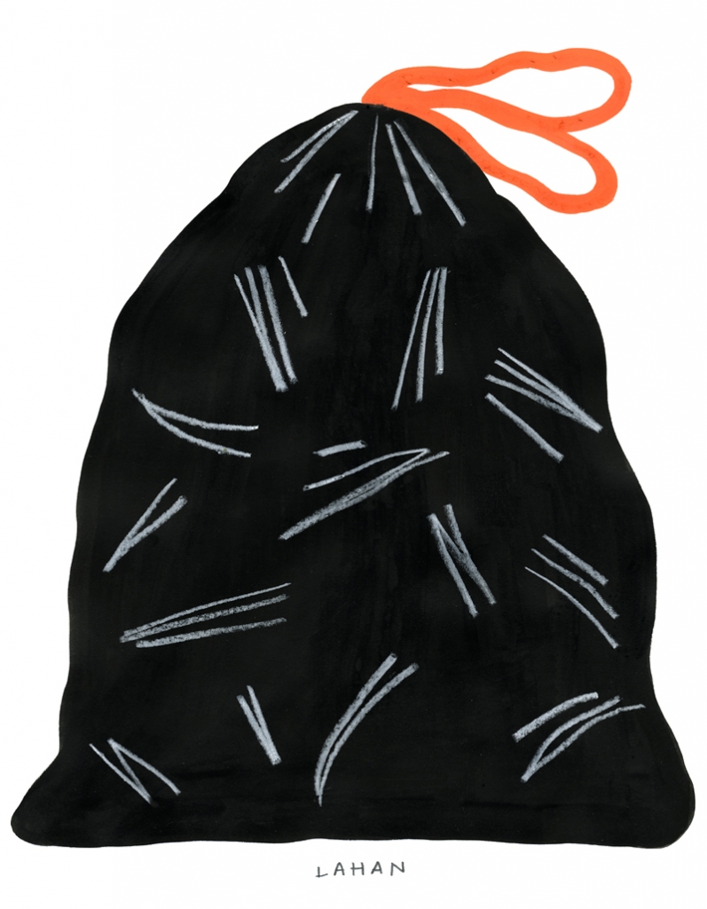
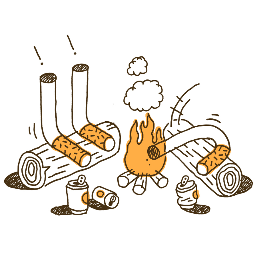
trash bags – transience
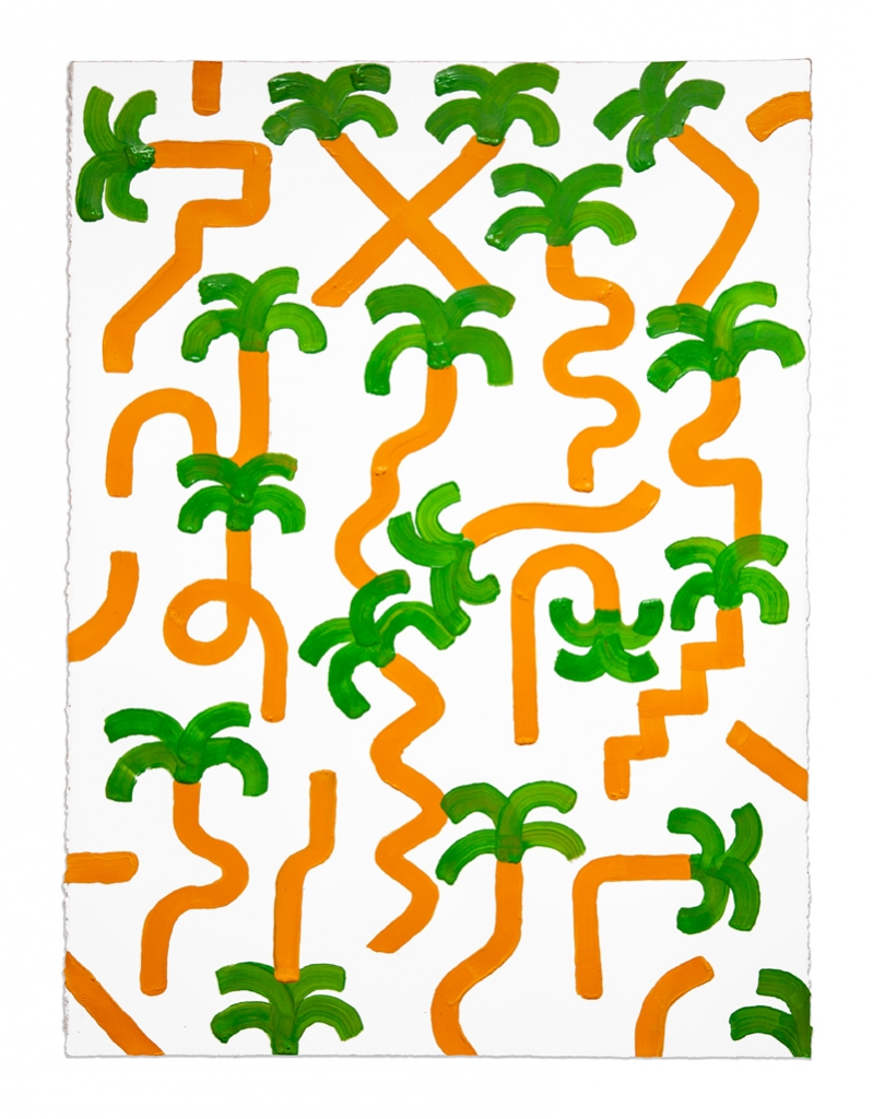
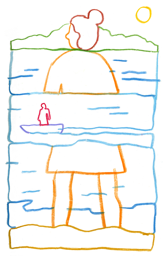
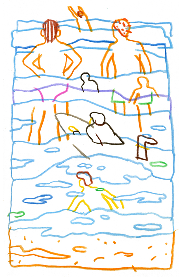
beach/tropical life – relaxation
basketball – symbol
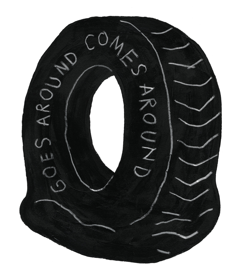
deflated tires – disfunction
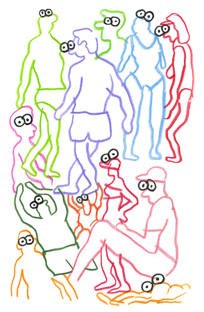
faceless people – simplification
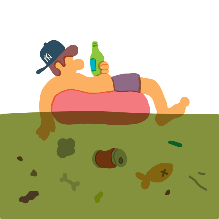
beer cans – yin and yang
Have your artwork and illustrations always lent themselves well to editorial work? Or did you at some point make a conscious decision to pursue editorial illustration?
My professional background is in graphic design, so I think looking for a means to communicate something naturally became a part of my illustration stuff. I didn’t really set out to get into editorial illustration. I was approached by a couple of friends who were working as Art Directors for Bloomberg at one point and it sort of stuck. Those illustrations started circulating and it just led to more editorial stuff.
Your work has a very direct and simple aesthetic; how have you seen your style evolving recently?
I think I’m getting looser with my technique. There’s definitely less concern of making thinks “perfect” or being neurotic about how something should look, in place of being more confident in making something and letting it be. I’m starting to play more with repetition too, which is something I tried to avoid in my earlier work. The flat tires and trash bags are an example of drawing something that lends itself to variation beyond just a single drawing.
Color palettes: always bright, always fun. Where do you see and come up with these colors and how do you think they contribute to your pieces?
I’ll admit I haven’t always had an eye for color. It still feels a bit like walking in the dark. I usually start off with picking a color that I like, and then just adding whatever looks good next to that color, and so on. Colors in old books always appealed to me, especially when the pages start to yellow and it makes everything look warm. I’d say I generally shoot for that feeling.
What do you draw with?
No magic tools or anything – I have a mug on my desk that has a lot of dull pencils, Sharpies, china markers, fountain pens, stuff like that. Depending on what I’m drawing I pick whatever line quality that feels right. If I had to pick one it would be a dull No. 2 pencil.
Tell us about the use of vices in your pieces? Lots of cigarettes, beers, all the good stuff.
I just think those things are funny. Sort of like how they say with food, “everything that’s bad for you tastes good.” I also like to use them as disruptions that remove any possibility of sophistication from a drawing.
How did the rock “collage” series come to be? What fueled that inspiration?
I wanted to poke around with formalism and the innate impulse to just build things, rather than making a joke or some sort of singular graphic. Around the time I started making those collages I was exploring how to convey a sense of weight with simple objects on the page. The early collages found the rock stacks ‘anchoring’ themselves to the bottom edge of the paper as if that were the ground. Lately the collages are becoming more sculptural, with the focus on building familiar things from crude shapes.
What’s your idea of the perfect summer day in New York?
Weather in the low 70s, very few people on the streets, hanging out in a park with my dog, no pigeons.