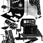
At any given moment, on any given day, you can find illustrator Bill Rebholz huddled over his desk, sketching long-legged gentlemen gripping their oblong belongings. He draws simplicities sans simplicity, exaggerating all interactions, aspects and ratios to parade the detailed oddities of life. A creature of observation, Rebholz’s eyes are fixated at all times, looking for people, experiences and surroundings to translate into elaborate visual narratives—the verve of an itemized laundromat; the quirks of the Postal Service’s mundanity. Nothing is futile when it’s embellished to life.
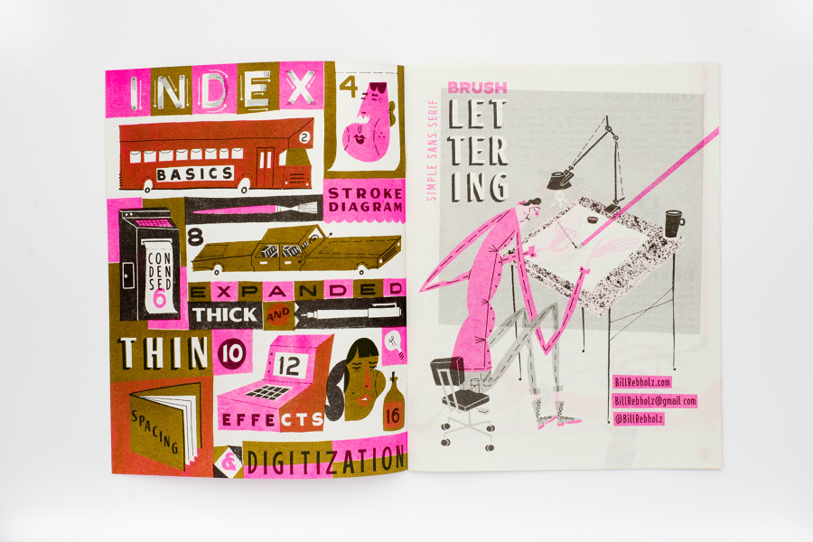
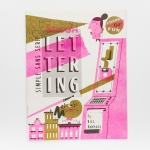
And then, as quickly as you think you know his style, he conforms to the reins of typography—his own reins, that is. (His hot pink Risograph-printed zine, Simple Sans Serif Brush Lettering, is our brush-typography bible.) Thick, full and straight, letters cut into whimsical scenes offering clarity where we had left it: in the world of Bill Rebholz. As an artist of personal and commercial dexterities, Rebholz maintains the perfect balance of what is and what should, cohering his renditions with ours and calling on all of us to look a little closer.
Give us the abbreviated Bill Rebholz bio. Who are you? What do you do? If you could go one place to escape the frigid Minneapolis winter, where would it be?
Bill Rebholz primarily works as an illustrator, but frequently serves in several other commercial art capacities. His work projects a street smart sense of humor, unique to his casual temperament and observant nature. Constantly informed by his surroundings and interactions, Bill lives in the details, yet lets his fascination with all things bizarre and idiosyncratic percolate into his reinterpretations of reality. You can currently find him hunched at a desk in Minneapolis.
If I could be one place to escape this cold at the moment, it’d probably be sunny California to see friends and get a healthy dosage of vitamin D.
Has your work always lent itself well to editorial illustration? Was it a conscious decision to work in this genre?
I have an immense fascination with all things commercial arts, in it’s many forms, and plan to work in it’s vastness overtime. For whatever reason though, a lot of my work has been editorial.
Does your editorial work differ from work that you would create for a show?
Yes and no. I think there’s a common vernacular among all of my work, in technique and visual taste especially. There can be similarities in subject matter too, as I have no reservations in pulling from my bank of personal interests if it’s applicable to an assignment. For me the difference is in the application. For a job, I typically create the art on some sort of easily scannable and stackable thick stock. Whereas for a show, the tendency is to work a little more monolithically, painting on panels, object or anything with more presence than a sheet of paper.
Tell us a little about the process when commissioned for an editorial project. Do you read the article beforehand to spark inspiration for illustrations? Do editors give you free reign? Is there some type of brainstorming involved?
Absolutely, I look for specifics and don’t mind direction (or lack there of), so reading and responding to the information presented to me is always top of the list. Time permitting, I’ll usually take in all of the info and direction presented to me and stew on it for a while before getting into sketching or working on ideation. Eventually I’ll find myself having an idea needing to be doodled down. Maybe an icon or lettered strings of words, something pertaining to the project. Those initial pieces will appropriate into my final ideas, and if those check out, on to finals. On the occasion of a open ended assignment, I usually spend more time drawing to generate more visuals to play off of.
Very cool GIFs. What’s it like illustrating for motion versus your normal stills? Does the process differ?
Although I reassemble and output most of my final work as digital, I paint the illustrations by hand in layers and scan the painted pieces as I go, as spending less time staring at a screen is always preferable for me. In that sense, the process is the same, I spend a bulk of the time creating the components of the animation. Many of the animations I’ve created are rather matter of fact, so I pay more mind to how they lay out and will move consecutively then dealing with creating a full composition. That being said, I look forward to making more environmental and interacting animations.
When you catch yourself doodling, what do you usually find? Is there one image/idea that you find yourself subconsciously coming back to?
I have an affinity for doodling people and their belongings. I’m interested in the things people keep around themselves, tchotchkes/trinkets/stuff, and the possessors themselves. Maybe because it’s like a little (albeit superficial) excerpt that says something about a person in physical form. I also like blobular things, and letters.
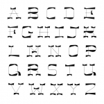
We are huge fans of funky typeface and hand-painted lettering, and it seems like you incorporate a lot of varying and awesome lettering and scripts in your pieces. Have you always painted or illustrated weird and unique lettering? What do you love about hand lettering?
In one form or another, I’ve done lettering since establishing an interest in drawing and painting. I love it because it pairs control with spontaneity. You have a set of characters that have designated anatomy, but are still open to your own interpretation. Likewise, you can obsess over continuity of shape, strokes, or curves, and become a near perfectionist, but there will always be that one detail that’s ever so slightly off. That’s the best.
We see almost a retro or classic 50’s illustrative style (something you wold see in the New Yorker in the 50’s) come through in a lot of your pieces. What do you love about this style? How would you describe your style?
Mid century illustration and animation has certainly had a significant impact on my stylistic tendencies. Although, I’m not only inspired by the commercial art that was produced then, but also by the art and ideas that influenced the people creating it – things like cubism or folk art – and how those influences were synthesized back into the illustrated/animated products. That’s how I’d describe my work I suppose, as a synthesis of the things I absorb: art, music, personalities, surroundings, all brought together, filtered and projected out as the content of what I make.
How do you decide on color palette? Is there a set of colors you always find yourself going back to or always building off of?
There are colors I love and call upon frequently, and there some that I throw into the mix to try out, some of which work and stick, and some don’t. My choices also change when painting or printing as opposed to setting them digitally. But usually I work paired down, limited color palettes have always been a preference. I’m especially drawn to ochre-y tones and fluorescents. Something about mellow muted tones butted up against the brightest of brights brings me joy.
Check out more from Bill on Instagram: @billrebholz
-
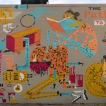
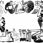
- For Die Weltwoche
-
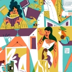
- For GQ
-
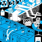
- For Ota + Pollen
-
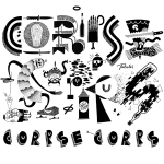
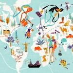
- For Corpse Corps